Typography is an opportunity to communicate beyond words
In design, nothing is decided by default. Every element is chosen deliberately, helping to reinforce the message. For brands seeking ambassadors and social media influence, creating a cohesive tone and feeling for your brand is imperative. Typography is part of a visual landscape, so the choice of type should match the overall vision.
Here at Red Thinking, we consider design, along with content and strategy, to create a unique vision and feeling for each brand. Increasingly, we’re seeing consumers evaluate how a brand makes them feel, and that starts with how they react to your message but also how they feel about your logo, colors, and, yes, fonts.
Why is it important to cultivate the right feelings for a brand? Those feelings help potential customers understand how your brand fits into their lives and why and when they should use your product or service.
Choosing the right font
Typography should be viewed as another opportunity to convey a feeling to reinforce the brand vision. As content is changing, sometimes typography is the only element at our disposal, so it’s important to utilize it in a way that benefits the brand.
When it comes to selecting a font, there are many existing options and limitless possibilities with custom fonts. Brands always want to speak with their own voices which can mean using a new, trendy design or using an old typeface in fresh ways.
If selecting a new typeface across the board isn’t realistic for you, we suggest subtler changes like adopting a new subhead font that balances or refreshes the font library, experimenting with fonts for Instagram content only, or changing the color of text. All to help deliver the desired feeling.
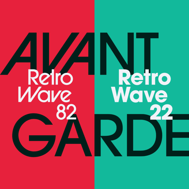
Looking at some of the latest typography trends can also be inspiring and incorporating contemporary styles can keep materials from looking outdated. For example, retro aesthetics and nostalgia are all the rage right now. Certain retro typefaces are timeless and perfect for the modern retro wave we are in. The typefaces are flexible depending on how the type is laid out.
Of course, keep in mind that not every trend is the right fit for your brand, no matter how popular it is at the moment. Also, design trends tend to have a shelf life, especially if the whole marketplace adopts the trend.
Thinking beyond print
We live in a digital era that has changed the way we read and receive content. Typography has had to evolve. While some of those new changes are practical, others are just exciting. For example, we’re seeing new capabilities in web development allow animation, 3D, and variable fonts to create a more engaging experience.
Variable fonts change their width, weight, slant, and more according to interaction or other criteria, such as time of day. These fonts are breathing life into something that is typically static at a time when web design is embracing anything responsive, interactive, or adaptable.
Thoughtfully chosen web fonts can help a site stand out, and play a role in the User Experience. Every part of a website, from content to navigation to forms, includes text. That’s why typography is so important in digital use – missteps can create friction or turn off users.
Combining typography with other web design trends can help keep a site looking fresh and relevant without changing a word. It’s a relatively simple way of showing that your brand is investing time and effort to stay current.
In marketing, words matter. Selecting typography that enhances those words helps convey your desired brand feelings and gives brands an edge in the digital realm. If you’re looking for ways to infuse your brand with emotion and meaning, contact us! Email me at Hello@RedThinkingLLC.com.


