The creative process can be a mystery to those outside of the design world. Designers seem to pull logos out of thin air, finding exactly the right way to communicate a message through color and shape. They jot down notes in meetings, sketching out ideas on the fly. But there’s a method to their madness and we’re pulling back the curtain on how the talented creative team at Red Thinking takes concepts from ideation through production.
To do that, we talked to Juan Plaza, VP of Design and Art Director, and Amy Bruner, Graphic Designer, about a recent project they completed for HITx, an innovative wellness and optimization brand that is changing the way we think about comprehensive health through the use of peptides. They walked us through how they shepherded this branding evolution from pre-call research through the final product, and every step in between.
Step One: Research
As soon as the team lands a project, the account execs are busy digging into everything they can find out about the client, and they share that knowledge with the creative team. At this point, the creative team’s goal isn’t to gain a full understanding of the client — they want to hear that explained in the client’s own words at the kick off — but, instead, they do want to arm themselves with a broad understanding of the industry and the competitors.
“We have an internal kickoff before the kickoff to understand more of who the client is and what their dynamic is. We pull research together from other websites in the industry and gain the knowledge to ask the right questions and bring new ideas,” says Amy.
With HitX, the details of the peptide industry were unfamiliar to the entire team, but it’s also cutting edge — competitors are few and far between. The team knew the real knowledge would come during the next step, the kickoff call.
Step Two: Kickoff Call
The kickoff call is an interactive conversation between the client, the account team, the writer, and the designers. Everyone is asking questions to uncover the brand’s unique story and their target audience, and that includes the designers.
“What I always try to get out of a client is the core emotion or core throughline for a brand. For HITx, not everyone is going to understand the science behind what they do, but it’s important for the brand to have a feeling or tone that someone can relate to,” explains Juan. He wants to dig deeper into the pieces that will help him create a visual story that will separate them from any potential competitors. He thinks about the one element they can pull out that makes them entirely unique.
With HITx and all clients, the designers look for themes that come up again and again. Amy recalls, “Kevin, the CEO, explained how peptides work, and I noticed that he kept repeating that they work differently for every person. HITx gets to know the person and their body’s needs first, and then digs deeper.”
Juan adds, “There was the idea that everything comes from within, from the core. It’s enhancing what already exists within you.” This inspired an idea that there is a center and all design elements come out of that.
They also drilled down further with the client on the target audience, trying to tap into a persona that includes demographics, location, lifestyle, and age. For HITx, the creative needed to feel relevant to a large demographic from 30s to 60s, and Amy notes that words like elite, overachievers, high-end, and health conscious were all used. These words would inform the logo iterations that began to take shape, including the X with a twist.
Step Three: Developing Initial Concepts
With the intel gained in the kickoff call, the design team gets to work. This is where the real fun and creativity begins. “The first round is just us playing with ideas and experimenting,” explains Amy.
“I throw out a bunch of concepts. I’ll sketch a full page of different icons. I might show 30-40 items initially, then I narrow it down to what I think is working,” says Juan.
He then chooses 8-10 concepts before meeting with the internal team to consolidate the list even further. Typically, the goal is to show a client between 3-6 initial concepts before the refinement process begins.
Juan explains, “With HITx, we were challenged to bring in the prescription element in the X. We also needed to illustrate that it’s always improving health, moving in a forward motion.”
Meanwhile, on the brand design side, Amy and Juan presented font choices they felt were high-end, sophisticated, minimalist, and simple.
The initial concepts were presented and HITx came back with straightforward feedback (an agency’s dream!). They wanted to lean away from science and towards high-end, while keeping the font choices and the general concepts.
Step Four: Refining the Concepts
The goal in refining the concepts is to focus everything on the core idea of how the creative team is defining the brand. “Everything we do and everything we create, we go back to the question, is this on brand? If we feel stuck in the design process, we pause, we go back to, is this on brand?”
For HITx, they asked themselves whether it felt centered, from within, sophisticated. Those are the central tenets they let guide the design and refine process, and it’s what led them towards a final design that blended the DNA thread with an X that hints at the idea of the prescription for a more optimized approach to wellness and a glow that feels high-end.
Step Five: Defining the Color Palette
Then, it may come as a surprise, but the color palette often isn’t even considered until the logo has been narrowed down to only one or two concepts. “We do black and white at first with logo projects because color is such a swaying factor. If you see something in a color you hate, you’ll eliminate the entire concept because you can’t get past the color. We want clients to focus on the pure design,” says Juan.
With sophistication at the core, the designers considered the feelings HITx wanted to convey. They kept the colors muted to feel high end, but that didn’t mean staying neutral. In the initial palettes, they chose greens because that tapped into the health and wellness aspects, while purple felt elite and royal. As the iterations took shape, the team leaned into green, but chose a shade that felt both sophisticated and approachable. Juan explains, “We mixed it in with gold elements and an expanded palette of black and gray for a high end look.”


Step Six: Delivering the Final Product
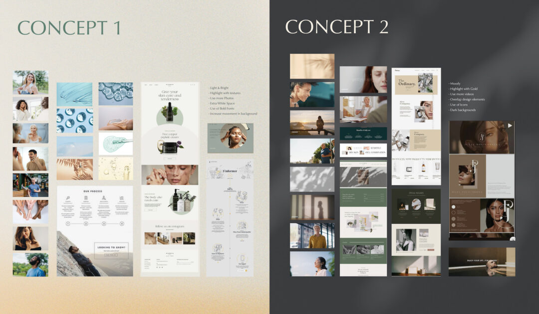
With the logo and color palette in place, the creative team turned to the overall brand imagery on the website, focusing on the idea of isolating bodies, strength, molecular power, and optimization.
“We had a lot of conversations about imagery and video on the website for HITx. We wanted to be conscious of who they were using to represent their brand and how we could allow the audience to feel empowered to make a life change,” says Amy.
All of the images and video utilized for HITx include movement. They represent how HitX’s clients are supposed to feel once they start the HITx peptide and optimization process, which was a shift from how the team first approached the project. The goal was to help people see themselves rather than be a purely aspirational brand.
All of the pieces came together in HITx’s final brand guidelines and website, one that the client is thrilled with and the team is proud to show off.
Amy reflects on the brand journey, “We’re building the brand as we go along. In the first stage, we’re getting all the different ideas out. We’re figuring out the feelings and where things should be more nuanced. We’re looking at different ways to accomplish the same message. It’s incredibly satisfying


