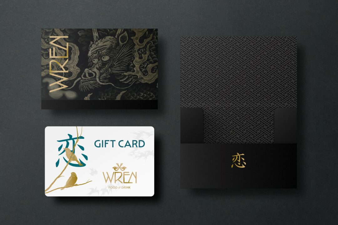
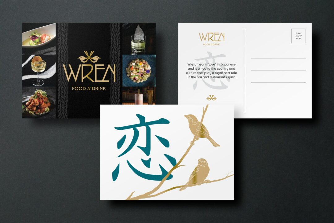
Wren
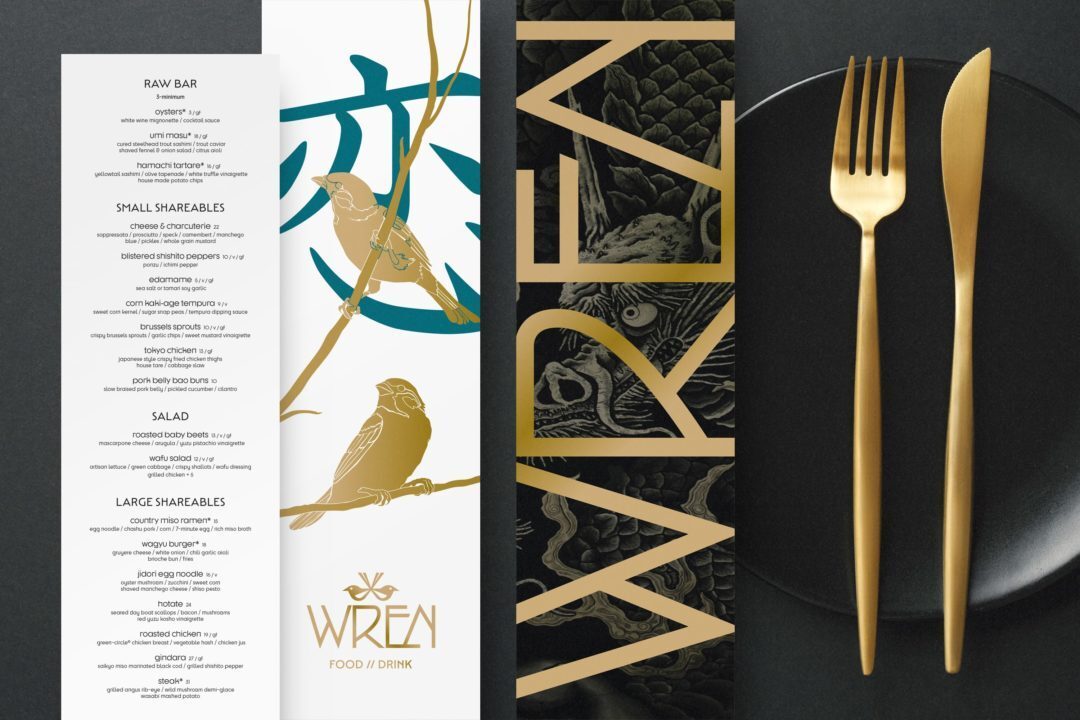
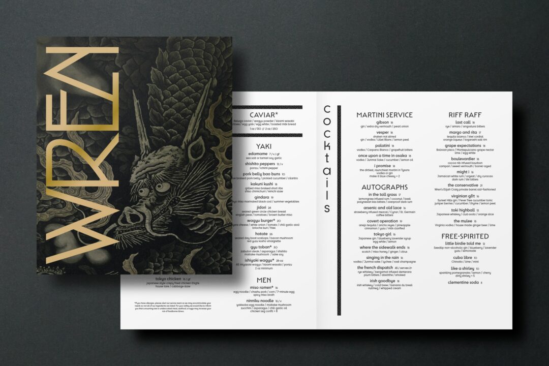
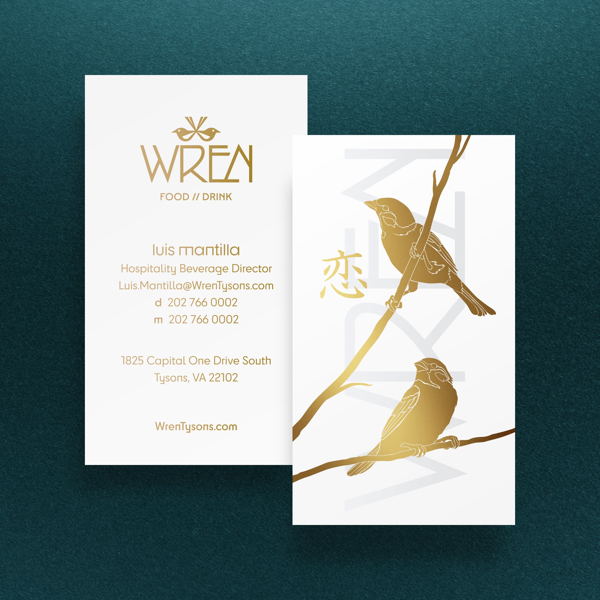
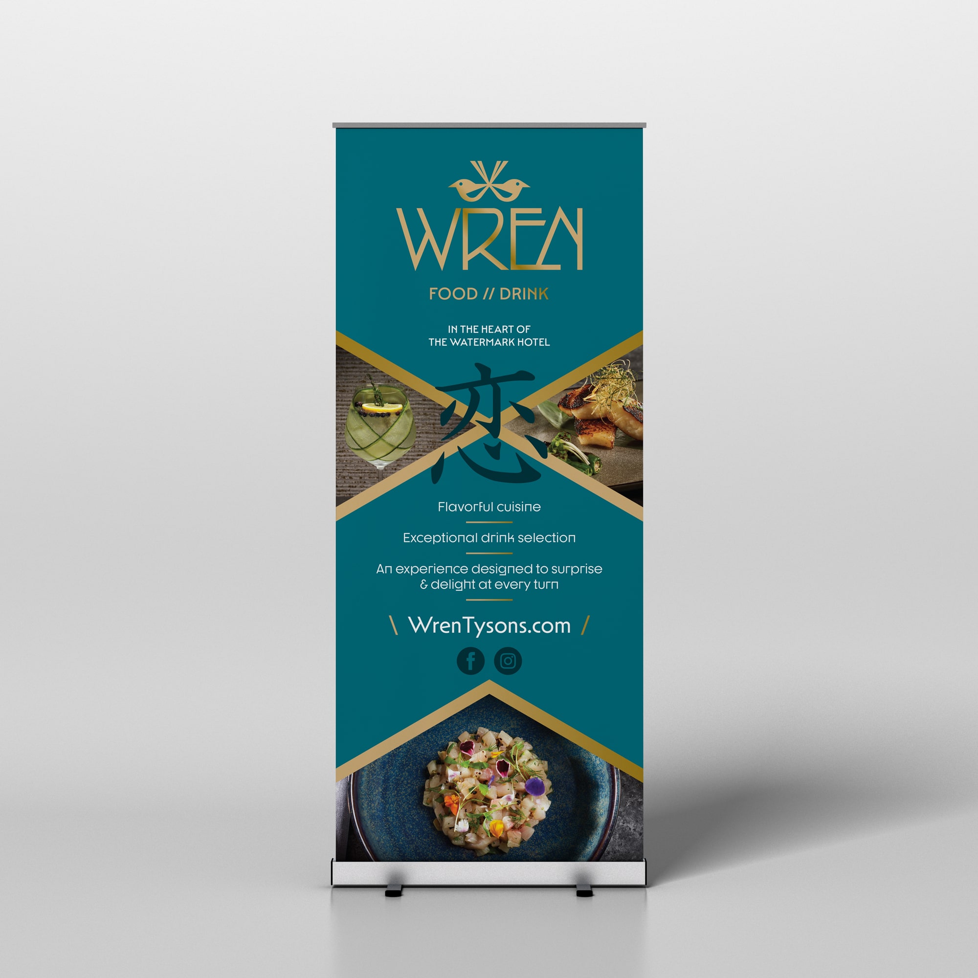
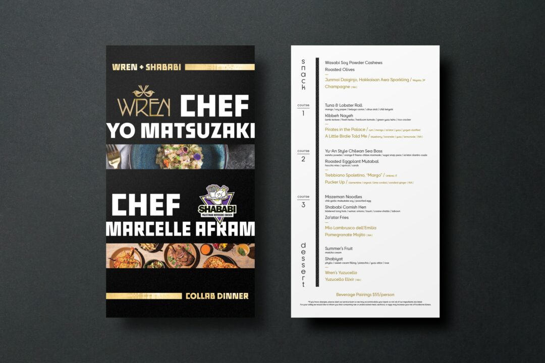
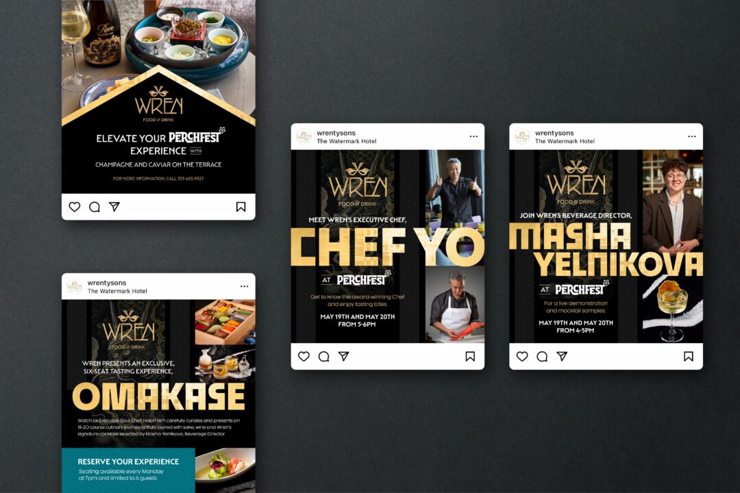
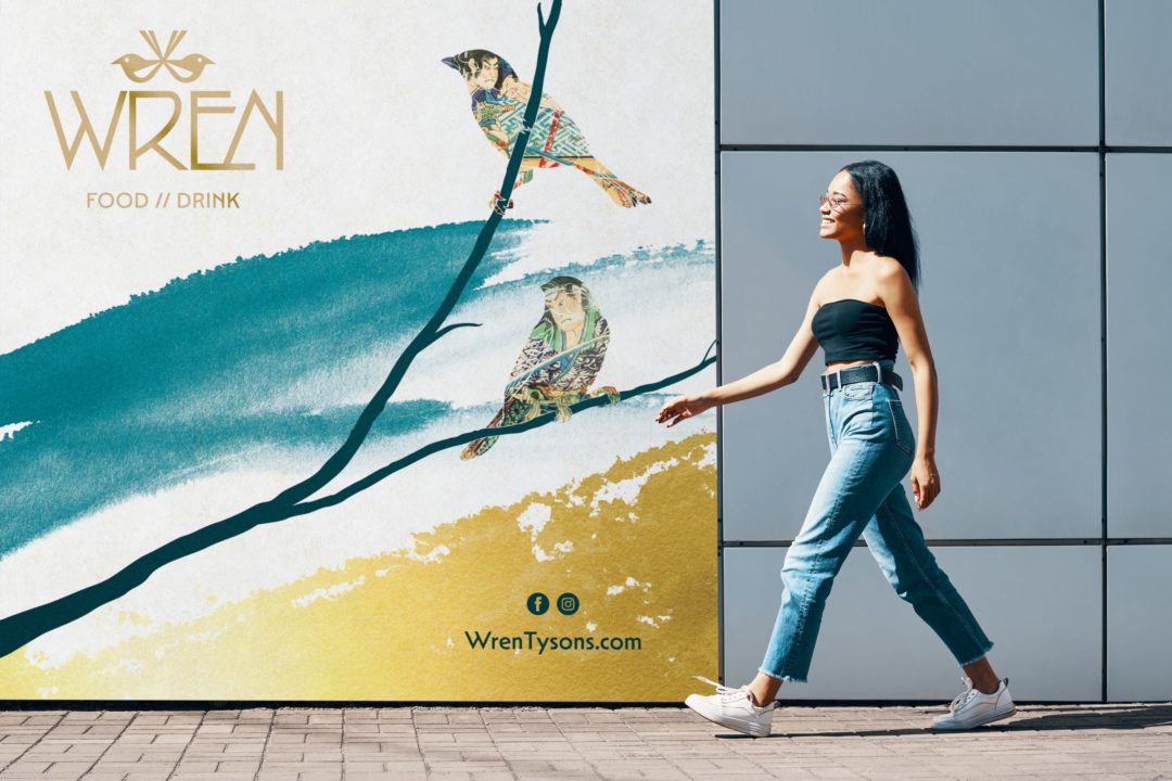
With Wren, the restaurant and bar at The Watermark Hotel in Tysons, VA, the brand artfully balances sophistication with approachability, like the food at Wren balances traditional Japanese street food with modern American cuisine.
In both real-life experience and through the branding that Red Thinking developed, it’s clear to see Wren’s characteristically warm and friendly energy is equally matched by its effortlessly cool spirit. While Wren is markedly unique, brand elements of Wren’s strategically tie into The Watermark Hotel’s branding to ensure both work well together within the same creative and to emphasize that the two are inextricably linked. After all, Wren is the centerpiece and social hub of the hotel.
Brand Vision
Brand Narrative
Brand Identity
Art Direction
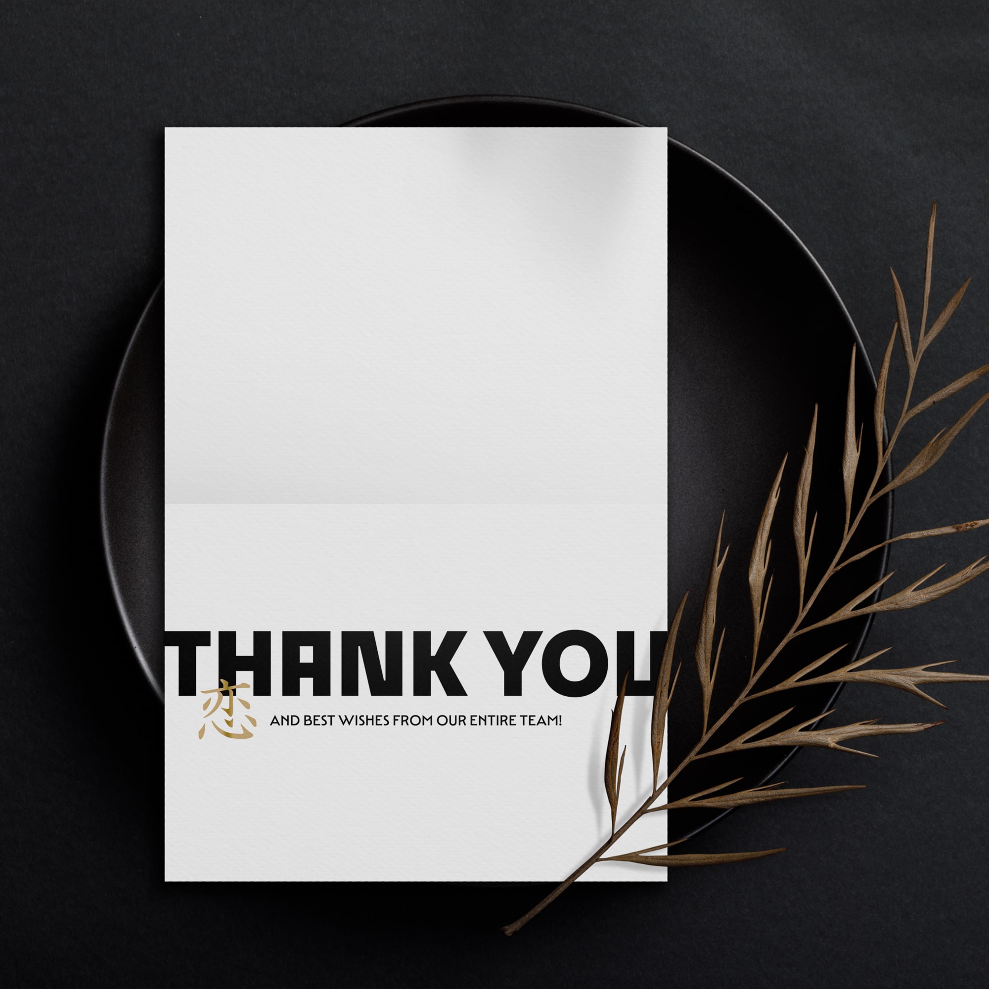
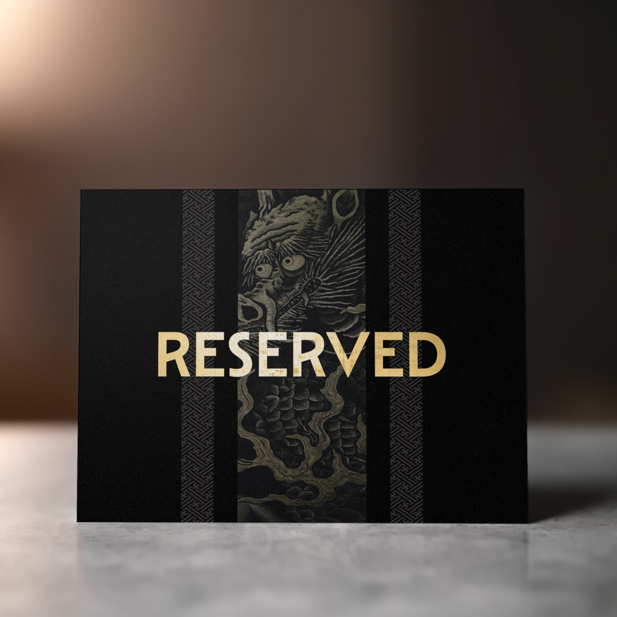
Print Design
Experiential Design
Digital Design
Website Design Consultation
“Red Thinking was able to quickly and fully understand the vision for Wren. They truly played an integral role in bringing Wren to life. From concept to execution, the team delivered and then some every step of the way.”
Other work.
Let's Get Started!